Transport Museum
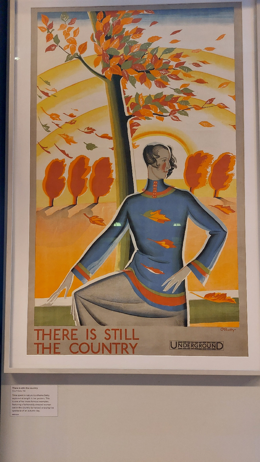
The first poster attracted me because of the color scheme. The warm reds, yellows, and oranges looked nice and it has a tree blowing in the breeze, making me feel cool as well. The poster isn’t advertising a particular destination, just that it can be used to get out of the city and into the countryside. It was made by Dora M Batty in 1926, and there were a lot of her posters featured in the museum. This poster was probably meant for middle and upper class individuals who could afford to leave the city for the day, giving up a days work, to enjoy the ‘clean’ countryside. Using public transport might have been seen as low class, so directly advertising leisure services to those of means would help to lessen the stigma a bit.
The next poster depicts the sum radiating heat on the surface, with lots of reds and oranges, while the underground is depicted as a cool reprieve, with lots of blue and green. The poster’s caption claims that they have a winter poster depicting the opposite, cold above and warm below. It was designed by Frederick Charles Herrick in 1926. I was attracted to the poster initially because it made me laugh when I read it. The design exaggerates the heat quite a bit, almost an apocalyptic heat wave, and it made me chuckle. I think this would bring some relief to a person of any class who had a minute to slip into the underground or take a trip, and be able to cool off for a few minutes on the platform or on their ride. People who had walked far for their job in the city might be enticed to spend a little bit of money to avoid the walk on a hot day.

This poster depicts Persephone, the queen of the underworld, being rescued by her brother Hermes, supposedly signaling the return of spring. It was designed by Dora M Batty in 1932. Persephone is meant to represent the underground and its connection to the countryside, especially in the nice spring weather. It almost looks as if the two are dancing, which is what initially drew me to the poster. This is another poster that is meant for the middle or upper class individual who can afford to take the day off and leave the city. I think only an educated person might understand the symbolism of this poster; I know I didn’t until I read the caption and did a quick google. I think a lot of Dora’s posters were meant for the well to do individual who might have hesitations about using the underground.

Henry Becks map was innovative because he did not use a geographically accurate design, instead simplifying the design to make it easier for customers to understand. Older maps would make a map of London and put the tube lines over it, meaning the inner city stations were very close together and the outer lying stations were spaced far apart. Beck’s design made the stops almost equidistant, smoothed out the lines and made the turns simple angles. He also color coded the separate lines so that they were easy to tell apart. This allowed customers to easily identify any stop on the map, the line it was on, and how they were going to get there.